Spotify Message Tags
A new music-sharing feature anchored in relationships that preserves the messages shared with music
ROLE
UX/UI Design, UX Research

Project Overview
Problem
Users say that music is a necessary and meaningful tool for expressing emotions and building relationships, but current digital forms of sharing music feel disjointed, limited, and not very meaningful.
Users really value the social role music plays in their lives, but Spotify doesn’t enable sharing music in a centralized social way.
Links sent through other platforms get lost and the music gets detached from the sender and message.
Solution
A new music-sharing feature anchored in relationships that preserves the messages shared with music.
How it works:
Spotify users can now share music with a written message within the app and the message stays with the music. Music that a user has been sent gets tagged with its accompanying message.
Like getting a burned CD from a friend with a note on the sleeve, the sender’s name, message, and music stay together.
Imagined as part of an in-app messaging system, users no longer need to hunt for links across different messaging apps. They can now see connections between specific music and friends, view and reply to messages, and continue sharing.
Process

Discovery
Two rounds of user interviews to better understand people’s relationship to music and why they share it with others
An initial round of conversations focused on how people share and listen to music, and the role music plays in their lives and relationships. A second round focused on key themes that had arisen.
10 participants, ages 20-40, who listen to music
60min each
An affinity map surfaced important patterns, shared obstacles, and insights into
the multifaceted role that music plays in people’s lives
Interview Insights
“It’s the thought that counts,” but practical limitations to sharing music make it feel less meaningful
Big limitations include:
Links are intangible, easily lost, and linked music blends into the rest of Spotify when opened
Lack of feedback from the recipient
It’s too tedious to dig for links through messages across different platforms
Music is integral to relationships and sharing it with personal messages is a valued social aspect of it
Users value seeing who shared specific music with them and why, usually more than they value the music itself.
Sending and receiving songs, playlists, and artists with other individuals had surfaced as the most frequent and personal way users share music.
Reasons for sending music
When music makes them think of someone, they want to share both the music and the fact that they’re thinking of them
Wanting to express an emotion they can’t or don’t want to articulate in words
Thinking the recipient will share the same feelings about it, such as nostalgia
In response to someone’s mood, such as wanting to cheer them up
Sharing is reciprocal —
Those who send music also receive it
The most common way to share is sending a link and a message through mobile text messages.
To get closer to finding the project’s focus, I created three working personas
Project Definition
Drafting and choosing potential problems to take on
I drafted roughly 20 problem statements from the three working personas, each with corresponding “How Might We” statements, and chose the two that felt the clearest and most important to users.
Ideation — Sketching possible solutions to explore how they would play out for my personas
I worked through a Crazy 8’s Ideation exercise of sketching ~30 ideas.
By this stage I had chosen to focus on the mobile app after research revealed a vast majority of users primarily used Spotify on their phones.


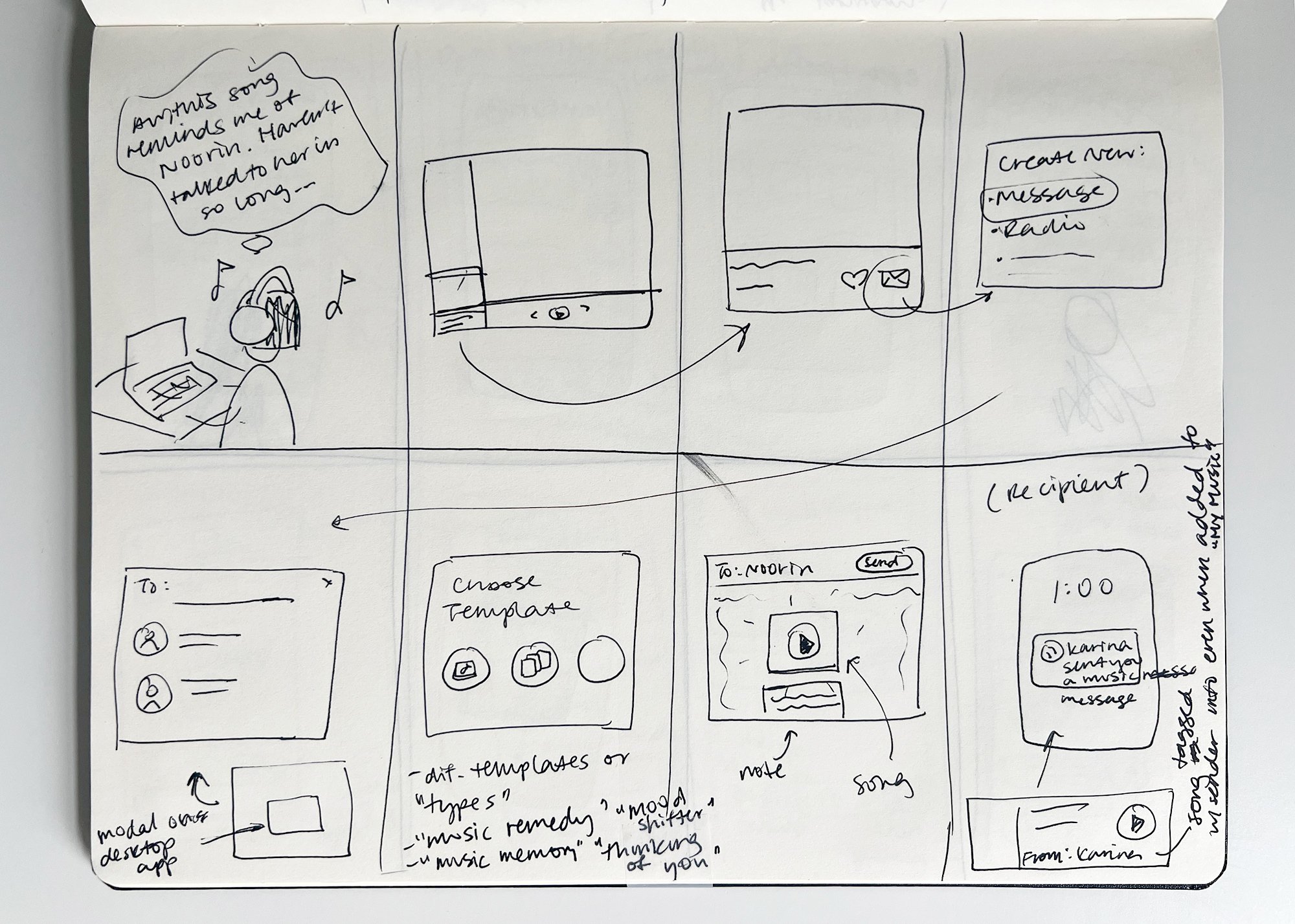
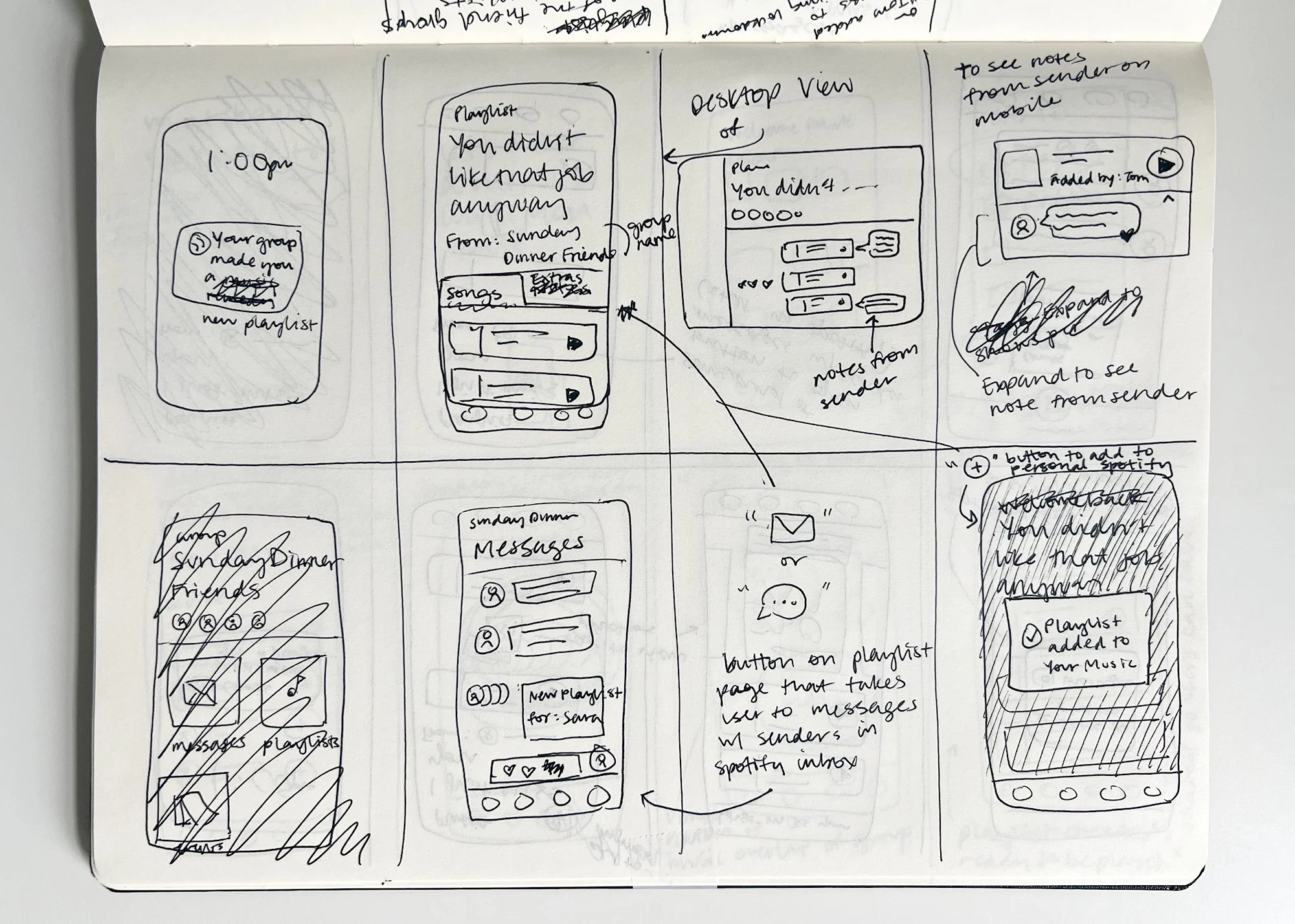
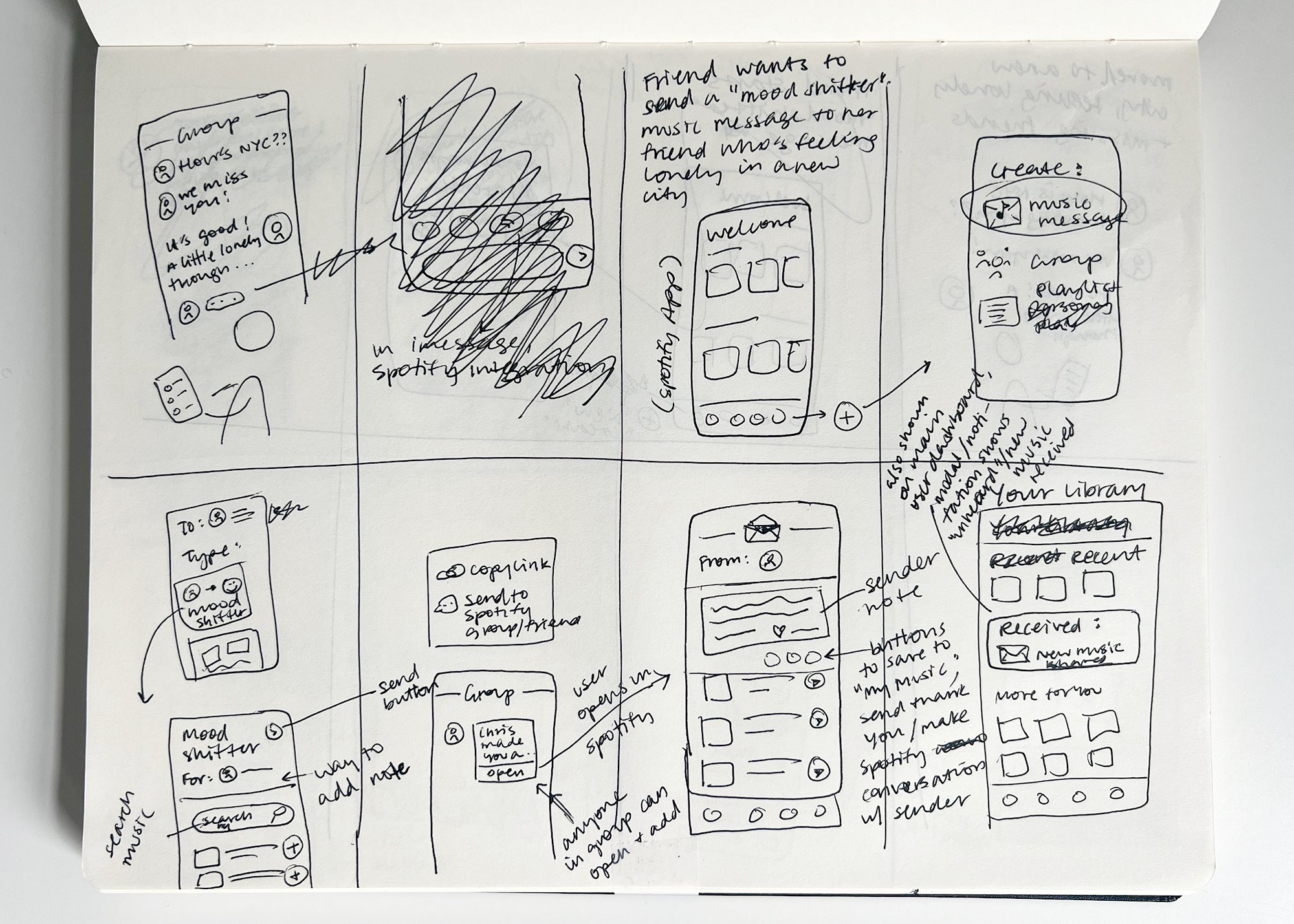
Storyboarding — Imagining potential use cases and user flows
I took the three strongest ideas through a similar Crazy 8’s storyboarding exercise.


Defining the problem
Users say that music is a necessary and meaningful tool for expressing emotions and building relationships, but current digital forms of sharing music feel disjointed, limited, and not very meaningful.
Users really value the social role music plays in their lives, but Spotify doesn’t enable sharing music in a centralized social way.
Links sent through other platforms get lost and the music gets detached from the sender and message.
Target user
User age 20-40 who actively listens to music and currently sends music to friends and family.
Proposed Solution
A new music-sharing feature anchored in relationships that preserves the messages shared with music.
How it works:
Spotify users can now share music with a written message within the app and the message stays with the music. Music that a user has been sent gets tagged with its accompanying message.
Like getting a burned CD from a friend with a note on the sleeve, the sender’s name, message, and music stay together.
Imagined as part of an in-app messaging system, users no longer need to hunt for links across different messaging apps. They can now see connections between specific music and friends, view and reply to messages, and continue sharing.
Secondary and Competitive Research
I analyzed various apps and platforms that include sharing between users, both within and outside of the world of music, to analyze how it was facilitated.
Beyond basic sharing functionality I looked for how they approached reminders, labels, memory triggers, and documenting exchanges between users.
Design
Primary User Flow —
While browsing Spotify, a user sees music with a message tag and views the attached message.
Wireframes
Setting up the right testing scenario
Users would encounter the feature during their usual daily listening. To set up the right testing scenario, I wireframed screens a user typically sees when using Spotify based on user interviews.
Focusing on adding the feature onto song cards as songs were mentioned as the most common “unit” of music users share
I prioritized clarity and simplicity to ensure it wouldn’t make the already feature-rich screen feel cluttered.
Trying out early icon designs
I began to experiment with the icon design which would be a primary aspect of the feature’s design.
Designing for an encounter rather than an intentional task
The message tags are meant to be noticed and used while a user is browsing which created the design challenge of making them noticeable, but not an interference or distraction
The primary user flow would then translate into the first set of wireframes for testing.
Icon Design
Designing an icon that communicates:
“Someone has sent you this piece of music”
It’s a button, you can click it to view the message you received
This is not a “Compose Message” button (a common function of similar icons)
A preview or hint of who sent it due to lack of space for full names
It also had to:
Feel intuitive, clear, and appealing without getting in the way of browsing
Be legible and easy to use at a small size on mobile in the context of users interacting with the app in their daily lives
Fit into Spotify’s greater brand system
Mockups
Working within Spotify’s existing branding, I took some time to learn Spotify’s design patterns and current user flows before drafting mockups for the first round of usability testing
Prototype, Test, Iterate
Two Rounds of moderated usability testing
Round 1 included 5 users in a series of 45min virtual moderated usability tests with the goal of getting lots of fundamental feedback.
Areas of interest:
Do users notice the new icon?
What do they think it is and what do they think it does?
How do they expect it to work?
Initial feelings about the idea of receiving messages in Spotify and having message tags on music
Would they like and use this feature?
Initial impressions of the new user flow and new message screen
Insights
The good news:
Most would use the message tag feature, both as a visual reminder and to access messages
Most users were excited about the idea of having music tied to the sender, noting they would love to be able to access and explore received music within that framework
All users would like a Spotify messaging system overall
All users noticed the message tag and said it was not a distraction
Pain points:
Back to the drawing board for the icon: nearly all users thought it was a button to compose a message and/or send the song, and many associate envelopes with email
Some users really wanted an in-between screen showing message previews rather than going straight to a message
Message screen confusion: Some noted it was unclear whether certain buttons related to the song or the message as a whole
Some noted it would need to have customizable settings for who can send them messages and which tags appear and remain
An affinity map gave me a clear view of users’ overall experience while preserving
detailed insights and questions that had come up
Design Revisions
Rethinking the icon design
I drafted new icons after users associated the first version with email and composing messages.
I also wanted to include an avatar to show who the sender is after hearing that knowing the sender would:
Make the feature more appealing and easy to use
Addressed the scenario of users not wanting to see or open messages from certain senders
New message preview screen that acts as a buffer before opening messages and allows for having multiple messages tied to the same piece of music
Better accommodates the scenario of having multiple messages tied to a single piece of music
Allows users to see more about the message before deciding to open, which users felt would be more comfortable
A cleaner layout on the message screen
Focuses on the message itself
Allows users to easily control message tag visibility
A second round of moderated testing with a revised test flow and scenario
Based on feedback in the first round, I set up a more natural scenario of searching for playlists and seeing message tags on the playlist screens. Users had said they nearly always search for playlists or artists, rather than individual songs
I also added a step in the test so users would encounter the icon in multiple states to understand how that affects learnability and the overall experience.
The new design was tested with 4 participants in 45min virtual moderated usability tests. Creating an affinity map afterward again let me identify important patterns and insights across users.
The good news
All said they enjoy the visual reminder aspect because:
It creates a more streamlined way to enjoy music they receive
It feels meaningful to connect people to certain songs and to easily see messages
Having text paired with shared music is essential and this facilitates that in a streamlined way
Compared to the first tests, most participants no longer interpreted the message tag to be a “Compose Message” button
The icon showing sender initials was immediately clear to all participants
Message preview screen was helpful and clear
Most immediately understood the different icon states for “new” vs “read” message and many noted that seeing both states made the messaging aspect much more clear
Other key insights
Without knowing about the a greater in-app messaging system, many users associated the speech bubble icon with comments
Most users again noted they would love to access and explore music based on who they’ve shared it with, both through the message tags and in other ways the new framework would allow
The term “Song Messages” on the preview screen was confusing to most
Controlling and personalizing which tags are visible and who can send them messages again came up as an important aspect
Revisions
Revisiting the icon design to better communicate messages and conversation rather than comment
Small change in terminology—“Messages” rather than “Song Messages” after hearing “song” felt redundant
A/B testing for the revised icon designs
An unmoderated test via Maze focused on new iterations of the icon. 35 respondents were shown two versions of the icon as they appear on playlist screens and asked:
“Which version (A or B) looks more like an indication of a received message?”
They were then shown another set of screens showing icons in both the “new” and “read” states and asked if this changed their previous answer.
Key Takeaways
57% found version A to be the clearest and most appealing. Reasons given:
Several people felt more familiar with the speech bubble version, which played a part in their preference for it, (even if they recognized that version B made as much, if not more, sense)
The arrow in version B became confusing when seeing both states of the icon
Seeing both states of version A made it much more clear
The End Result

Next Steps
Moderated tests to further understand how users interpret and interact with the revised icon while going through a user flow
Mockups for additional scenarios such as a song with multiple messages and songs sent to friend groups
Reflection
It was really valuable to devote a significant part of the project’s timeline to a thorough discovery phase with in-depth interviews.
I continued to build the skill of drafting questions that prompt stories and help users freely talk through thought processes, as well as the soft skills of how to conduct interviews in a way that makes users feel comfortable with sharing very personal experiences and opinions.